It’s summer here in Canada and, because it doesn’t last long for us, many try to get outside and enjoy it as much as possible. Despite vacation schedules, we were able to achieve our Dovico Timesheet Summer Release in August. Let’s take a look at what was delivered in the latest release.
Dovico’s commitment to accessibility
A few years ago, we recognized that Timesheet was not where it needed to be from a user experience standpoint but making changes to improve the UI was difficult because of some of the architecture in use.
Over the past couple of years we’ve been reworking Timesheet’s architecture to make moving forward easier. With things like framesets now removed from the product, we started looking at where Timesheet stands when it comes to accessibility. We discovered that improvements are needed around accessibility so we’ve come up with a plan of action on how to improve Timesheet. We’ve posted the following article that outlines our plans to support the Web Content Accessibility Guidelines (WCAG) if you’d like to learn more: https://timesheet.dovico.com/blog/2024/07/19/accessibility-with-dovico/
Our Dovico team has already started training on the WCAG guidelines and have performed some testing to identify accessibility issues by using tools like axe DevTools and the NVDA screen reader. We also did some manual testing to see how Timesheet stacks up when it comes to keyboard support.
As part of our WCAG commitment, every release of Timesheet will include accessibility improvements and this release is no different. We’re just getting started but the following are some of the improvements being launched in this release:
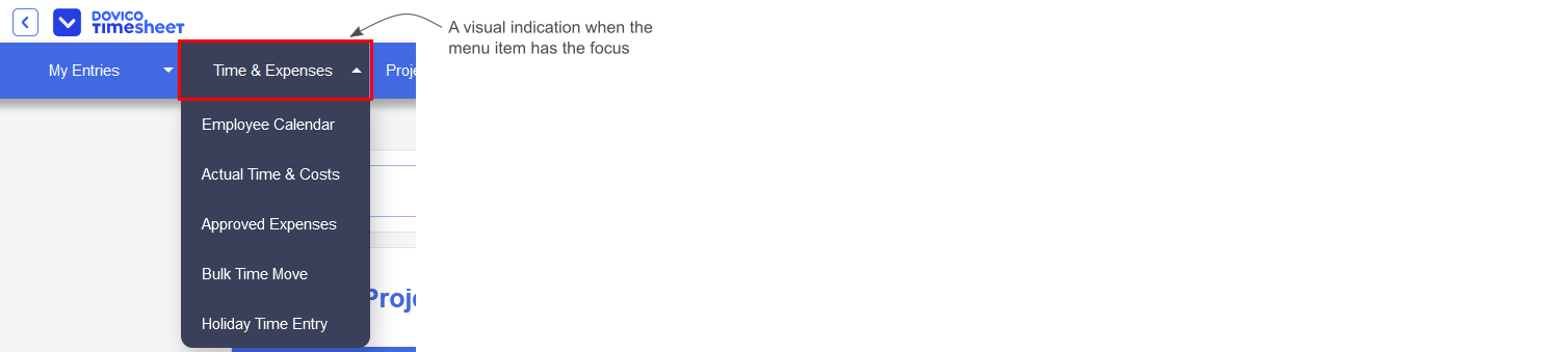
- As shown in the following image, there’s now a focus rectangle when a menu item gets the focus.
- A bug was fixed that prevented proper keyboard interactions with the menu bar. Now, when a main menu item has the focus, using the Enter/Return key or spacebar will expand the selected menu to reveal the menu items.
Hamburger menu
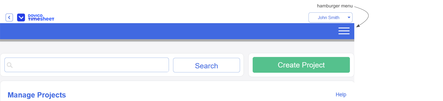
If you’ve ever tried to use Timesheet on a mobile device, or placed it side-by-side with another window on your desktop, you’ve likely discovered that you couldn’t access the menu items that extended past the right edge of your window.
We’re pleased to announce that the menu bar now turns into a hamburger menu if the menu doesn’t fit the browser window’s width, as shown in the following image.
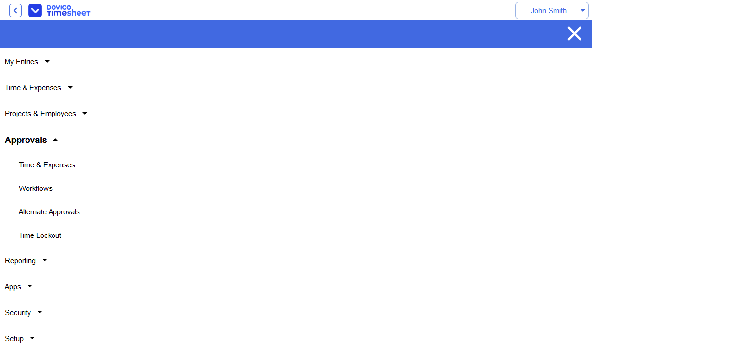
Now, as shown in the following image, all of your menu items are available to you regardless of the window’s width.
Removal of the white bar under the menu
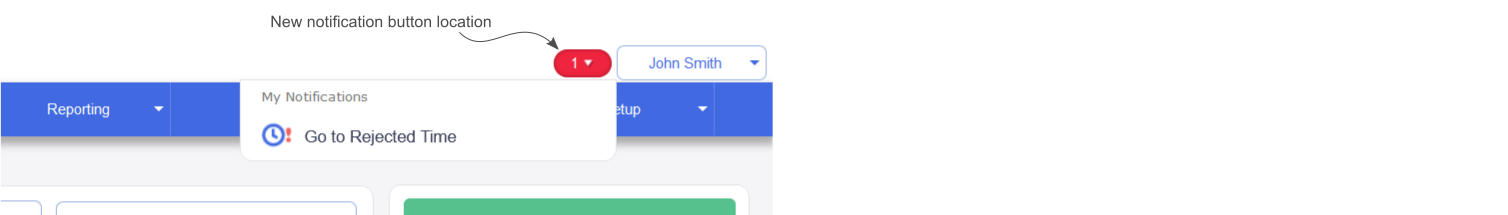
In an earlier version of Timesheet, we had the view’s title displayed on a white bar below the menu. The white bar would also hold the notification dropdown if you had any active notifications, like time needing to be approved, as well as a currency dropdown if multicurrency is on and you’re in a view that uses the currency dropdown.
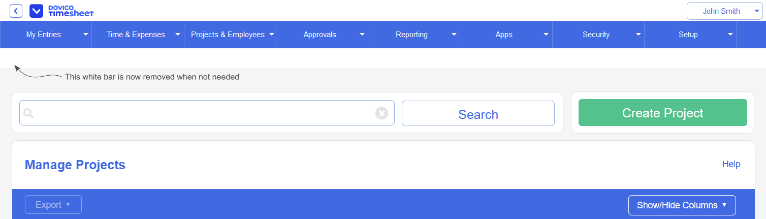
As we made improvements to Timesheet, we moved the view’s title to be closer to the view’s content but the white bar remained, taking up vertical space, even though it would often be empty as shown in the following image.
The white bar under the menu will no longer be displayed unless multicurrency is enabled and you’re in a view that uses the currency dropdown which includes:
- Actual Time & Costs
- Approved Expenses
- Time & Expenses if an expense sheet is selected
Because the white bar is no longer displayed for most views, if you have a notification, the notification button will now be displayed to the left of your username button as shown in the following image.
Billing view
A Billing view, shown in the following image, was recently added to Timesheet during this year’s Spring Release. The view allows you to create invoices based on project fixed costs or time and expense entries. You can read more about the Billing view here: https://timesheet.dovico.com/blog/2024/03/25/dovico-timesheet-billing-view/
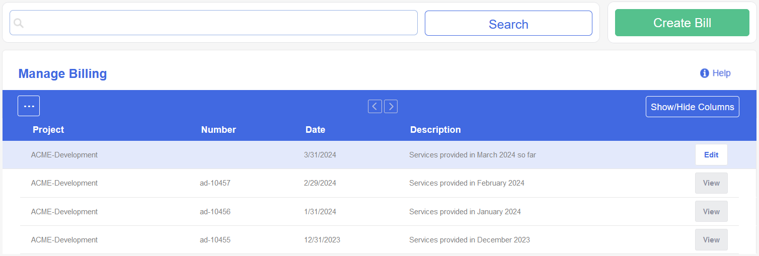
We noticed that the view refreshes whenever you finish interacting with the view’s dialog. Because that’s not a great experience, we adjusted the view to only update the row that’s modified rather than reload the whole view.
Billing API endpoints
When we originally built the API, we only added the core features of Timesheet and then we expanded on that over the years as needs arose. As part of our recent goals to expand the API to match Timesheet’s capabilities, we’ve implemented some API endpoints around the Billing view’s data.
With the new endpoints, you can now build scripts or tools to synchronize your billing data with other applications. The following API documentation will be updated to include the new Billing endpoints when Timesheet is released in August: https://www.dovico.com/developer/API_doc/index.htm
Project view
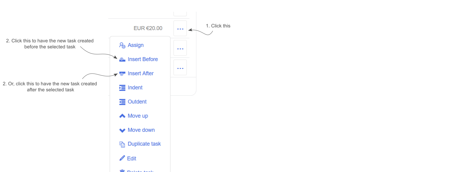
Up until recently, if you wanted to create a new task and place it at a specific position in your list, you’d need to create the task at the bottom of the list and then drag it to where you needed it.
Now, as shown in the following image, there are Insert Before and Insert After menu items that allow you to create the task right where you need it!
Project Summary view
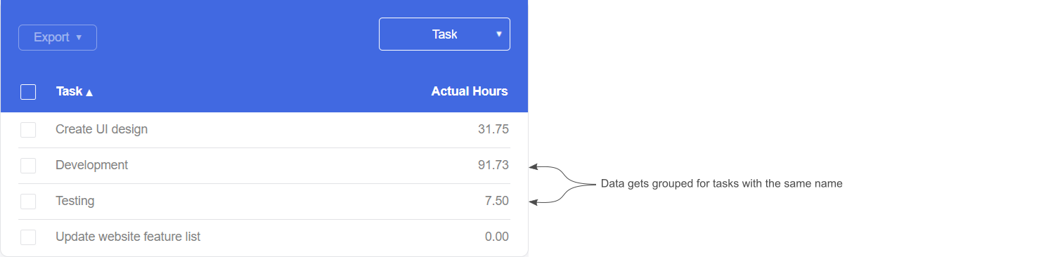
The Project Summary view offers a quick way to view time and cost information for a project. The view includes a grid that lets you view the project’s time entry data grouped by time entry, employee, or task.
When the grid’s grouping option is set to task, time entry data is rolled up by task. This is good but might be confusing if you have a project structure where multiple tasks have the same name like the ‘Development’ and ‘Testing’ tasks shown in the following image:
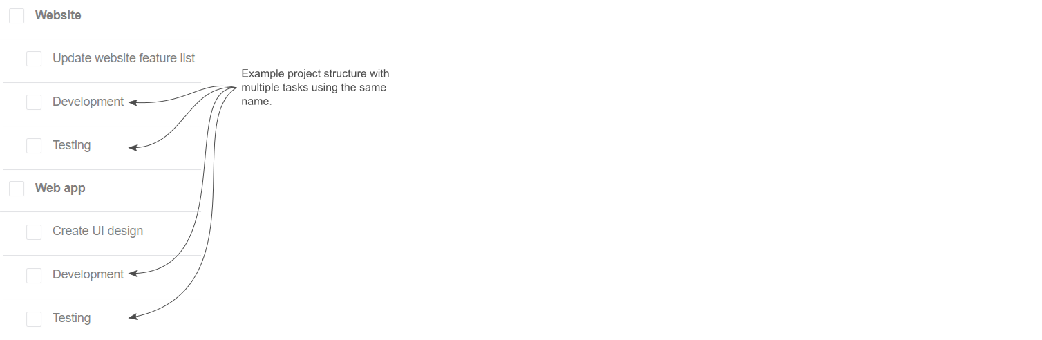
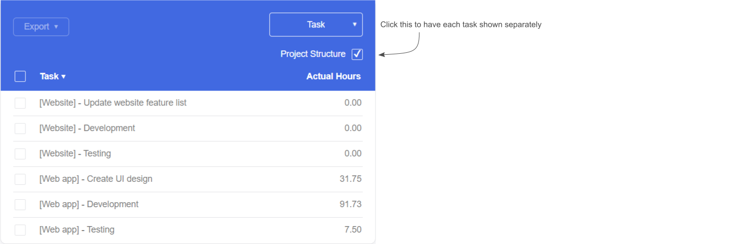
The current task grouping of the view, shown in the following image, might actually be desired if you want to know the total time across all Testing tasks on the project for example.
Based on this example, however, you may want to see what the totals are for each Testing task on the project. In this case, there is now a Project Structure checkbox. When checked, each task’s information will be displayed individually as shown in the following image.
Reporting view
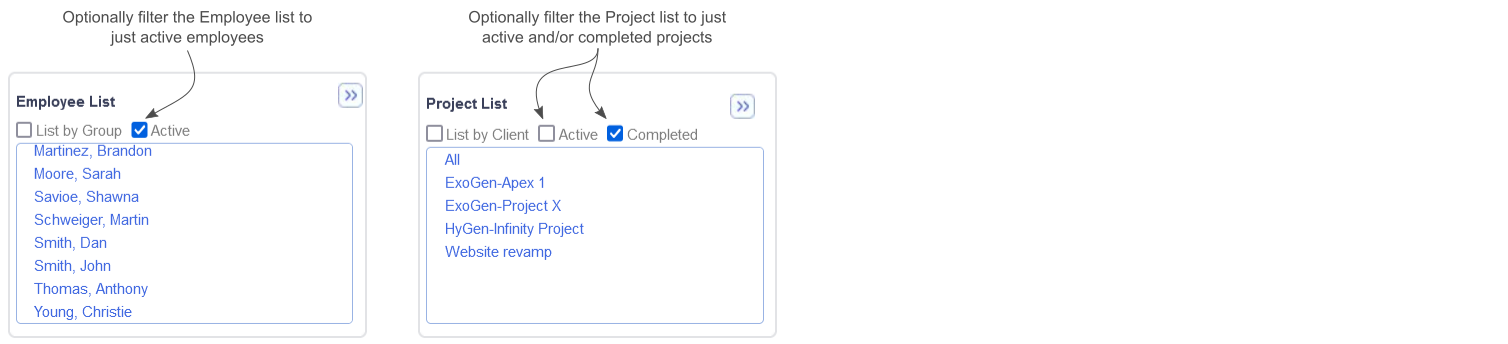
If you have a large number of projects or employees, finding the item you want to select in the filter list for a report can be difficult. Because of this, as shown in the following image, the Employee and Project lists now have options allowing you to filter the data:
In Conclusion
We hope the changes coming to Timesheet in this release make your lives a bit easier and help improve your productivity.
Stay tuned for more news as we strive to improve Timesheet’s accessibility and ease of use with each quarterly release.
We value your input. If there is something you’d like to see in Timesheet, or something you feel could be improved, let us know: dovico.com/contact
If you’re not yet using Timesheet, check out our website where you can sign up for a free 30-day trial to see if Dovico Timesheet is right for you: https://www.dovico.com/pricing
Gerard Gallant,
CIO of Dovico Software
Stay informed!
For more information on how and when regular maintenance is performed on Dovico servers, please check out our Maintenance Window Policy.
Please let us know if you are experiencing any issues with our software or have suggestions about how we can improve your experience by contacting our friendly support team.
Please reach out with any questions or feedback!