I’m Angela Campbell. I’m a Graphic Designer from PEI and live and work in Moncton, NB. I attended McKenzie College for fine arts and Graphic Design and am now studying Photography Media Art. I’m also interning at Dovico Software as a Graphic Designer. In this blog post, I’ll talk about the ups and downs of designing Teamset‘s logo. It’s more than just a logo. It’s a story of internal struggle and positive personal growth.
As an intern, I was given the task of coming up with the Teamset logo. Teamset is a new product from Dovico that narrows down many issues teams have with having too many tools and decentralized information. The disorganization leaves teams unmotivated to tackle the tasks at hand. Teamset helps you track and focus efforts to get that project win.
My design process
When I create a design, whether it is a logo or a social post, or even a business card, I follow a design process that’s my own. My design process may be different from other artists and designers, but that’s OK. All designers have their own way of thinking about what they need to be to design.
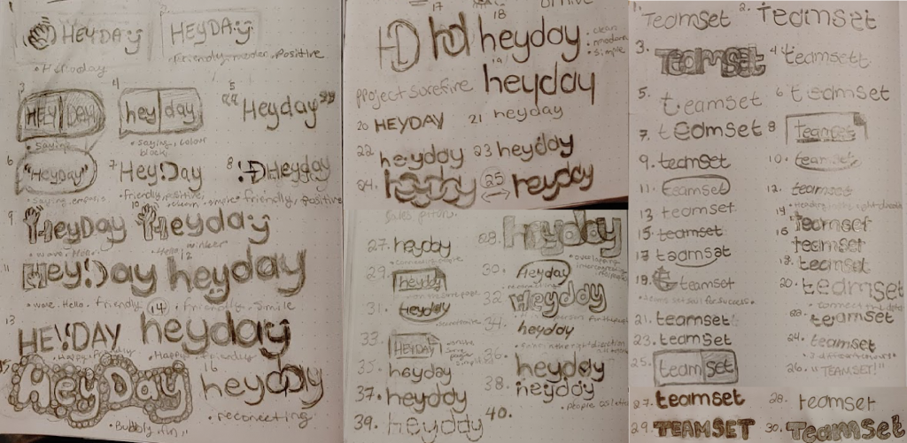
My process begins with a briefing to know what to keep in mind while I am designing. That briefing contains the product’s pillars, drive for the brand, and key terms. Once those are determined, I move on to research and sketches and then show them to the team. Together we pick a direction to go in.

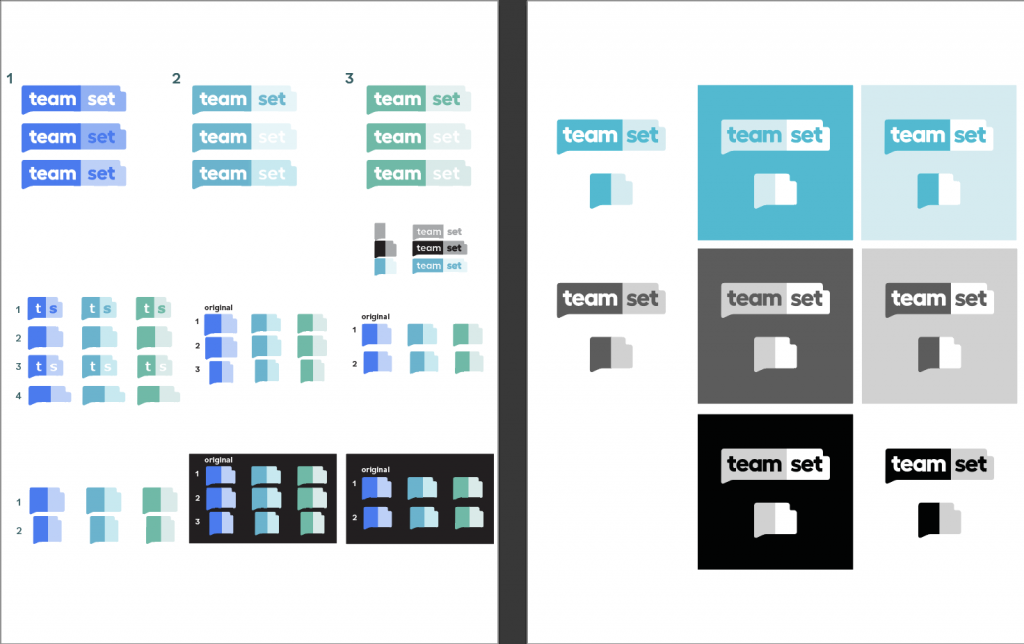
Once we have a general feeling about which sketch we will lean on, I begin the digital transformation. Now off the “paper,” we meet again to review, make suggestions, make changes, pick three or four designs, and then clean up and fix. Once we have a working design, we pick fonts and colour and finally clean up to make sure the logo is perfect.
Graphic design can be a mentally challenging activity
During my process, I always come across challenges and fears. The challenges and fears I came across this time were mainly internal such as asking myself, “will they like it?”. I often struggle with this question because I am a new designer. I want my clients to be happy and want my product to be perfect, so I add more stress on myself by doing this. I also struggle to overthink fonts and colours because there are millions of variations.
I also struggle between thoughts of “is this too much?” and “is this not enough?” I then play the endless game of adding and subtracting. Ultimately, I make a drastic change and then undo it because it ends up looking worse. All of this overthinking becomes time-consuming, not to mention energy draining. But it’s part of the challenge I love the most, finding that balance.
What I learned from designing Teamset’s logo
As with most things in life, you have to face fears and tackle challenges to learn, grow as an individual, and be successful. I learned a few new things from this experience, such as:
- When creating a logo, you have to go right down to pixel level -you have to triple-check to make sure every pixel is in the right place.
- Also, consider all the space in the logo. The human eye tends to look to the upper right-hand corner, so centring is very important.
- I’m not alone; it’s OK to get an opinion. For this task, I was working with seasoned designers Dominique and Estelle. They both have a lot of experience and knowledge, so their thoughts were very valuable to me. However, when doing design, it’s not just the professional eyes you need. It’s everyday people around you as well. The untrained eye can sometimes see flaws that designers would never think of.
- Finally, research, Research, RESEARCH! It may seem redundant, but research is everything; without it, you may as well design blindfolded.
Challenges and fears are not the only things when it comes to design. If they were the only things, I think a lot of people would not be designers. After all, design success makes the job rewarding and worth all the effort put into it. Especially when you see a client’s face light up and say: “That’s the one! That’s my logo!”

Success in design is not the end result
My Teamset logo design project’s successes were that the concepts were taken well, and the team was impressed throughout the project. The logo only needed three or four revisions rather than the usual hundred or so. That’s an exaggeration, but sometimes it can feel that way.
The colours I presented were right and led to a cultural work change for the product. The team wanted to go with blue to make it feel more like the parent company. However, one of my colour options was a teal. Teal combines the stability of blue with the growth of green. I believed that teal would fit much better, and after giving my explanation as to why it would be a better fit, the team agreed -that was a massive win for me. Another success was the positive feedback from everyone, including those not in the design group.
Here’s a breakdown of the Teamset logo design
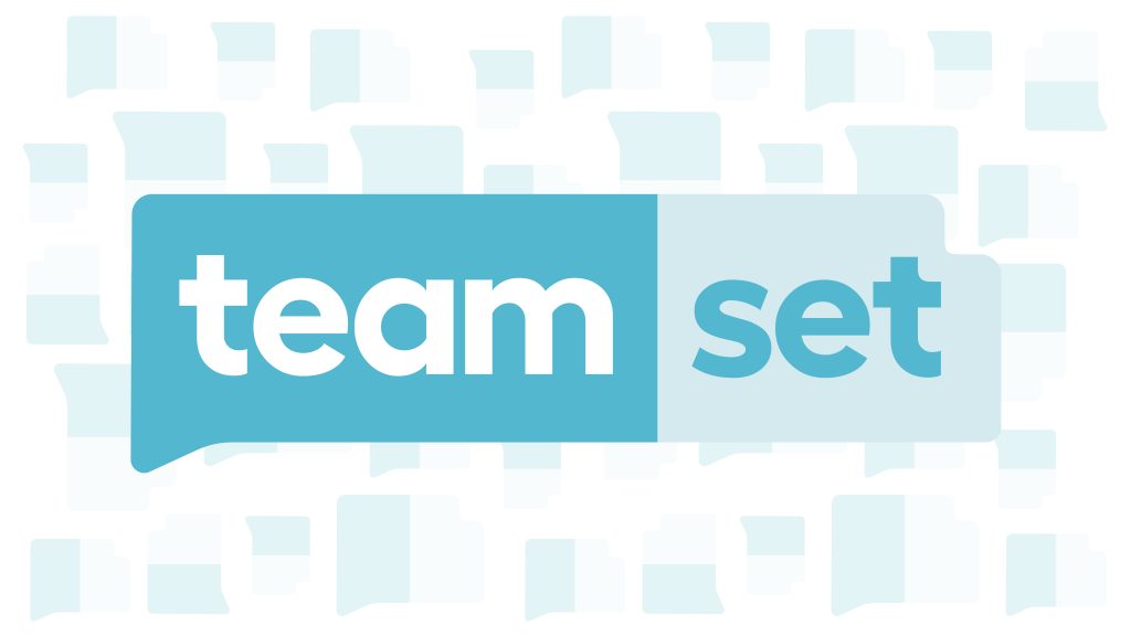
The design is based on a speech bubble concept that is also a bending sheet of paper. The idea is that the bubble represents text and communication. The sheet of paper with a bent corner represents teams being on the same page about their project. Together these elements combine the brand’s pillars; value, priorities, and contribution to bringing people ahead at work.
The font I chose works to support the design by being lowercase, which tends to feel more friendly. The curves and hard edges support the product being a baby of Dovico, which has been in business for over 27 years, yet still provides a soft modern new feel.
We chose a bright colour because it is a software logo that has to really jump off the page. The teal colours, teal being a blue-green mix in which the blue is the more dominant colour, bring a stability and growth appeal to the product. In which the product is a growth of the company’s culture. Combining timesheet tracking with connecting the value of team communication.
Conclusion
In conclusion, I have grown as a designer from this gratifying experience. I learned new tips and tricks, and the overall design turned out very well. I now feel confident about my team’s design, and more importantly, I feel more confident in my design decision-making. Overall, I am glad to positively influenced the Teamset product.
