Heads up!! We’ve got some changes coming your way! You may have noticed that many of our views were going through an identity crisis. We’re sorry about that!
Will, a member of our software team, Dominique our UX guru and Desmond, our QA specialist have been working hard on making your experience a lot more consistent. And they’re excited to deliver these revamped views to you!
We’ve done our best to ensure that your work doesn’t get interrupted by these changes. However, JD and Trent on our support team are on hand to quickly get you back up to speed, should you have any questions or concerns. You can reach out by online chat, email (support@dovico.com) or telephone (800-618-8463).
Without further delay, here’s a quick update on what screens within Dovico Timesheet are getting a major overhaul:
Note: All screenshots are clickable to view in fullscreen.
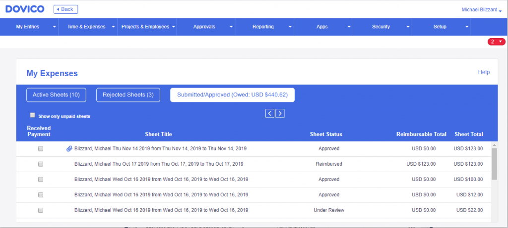
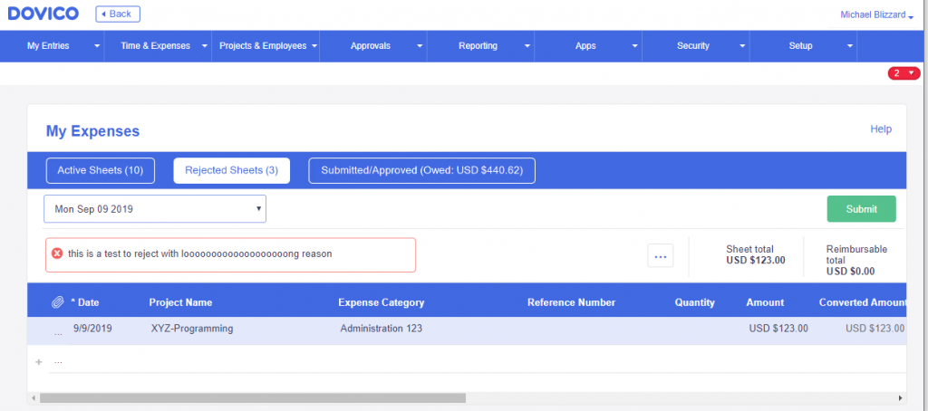
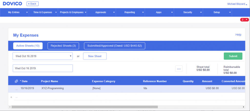
My Expenses
The My Expenses view within Dovico has been given a complete cleanup and looks the most different from all of the changes we’ve made. This is why Owen, our Product Manager and Jesse, our resident creative hot dog put together this little video to highlight the changes. Give it a view!
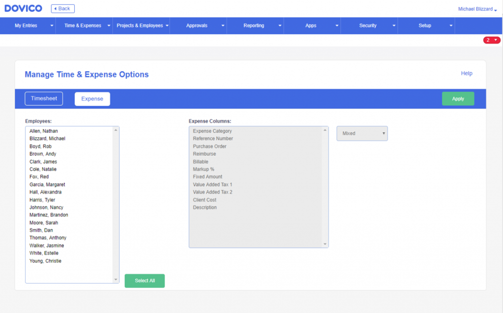
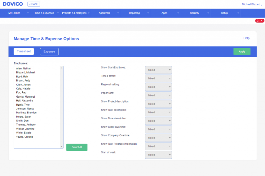
Time & Expense Options
Not a whole lot of changes here to the Time & Expense Options views other than a few cosmetic tweaks.
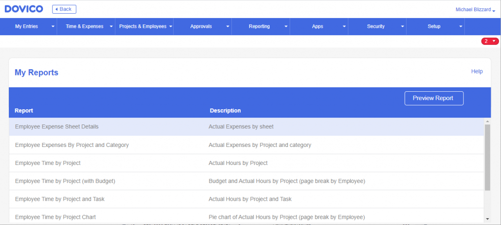
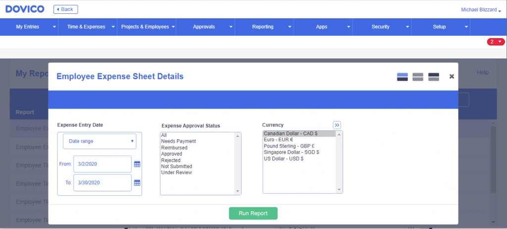
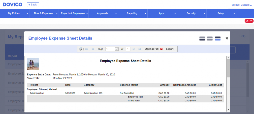
Reporting
Our renowned Reporting Views still function the same and have all the same powerful customization tools that you’ve come to rely on. We just gave it a facelift.
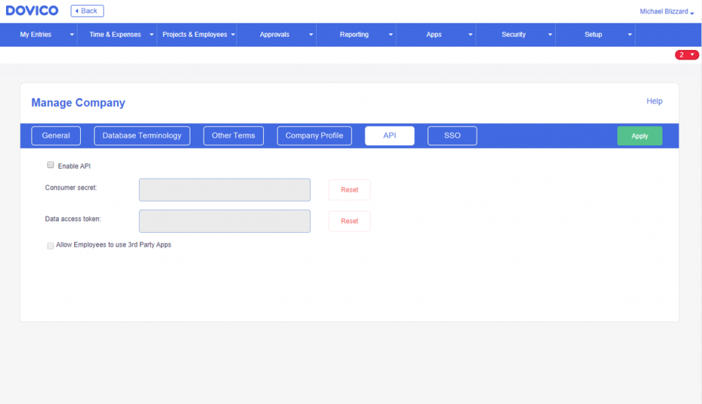
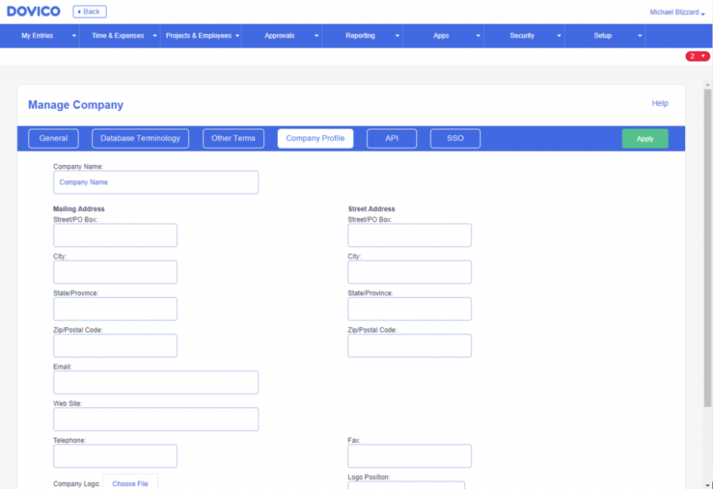
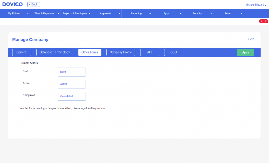
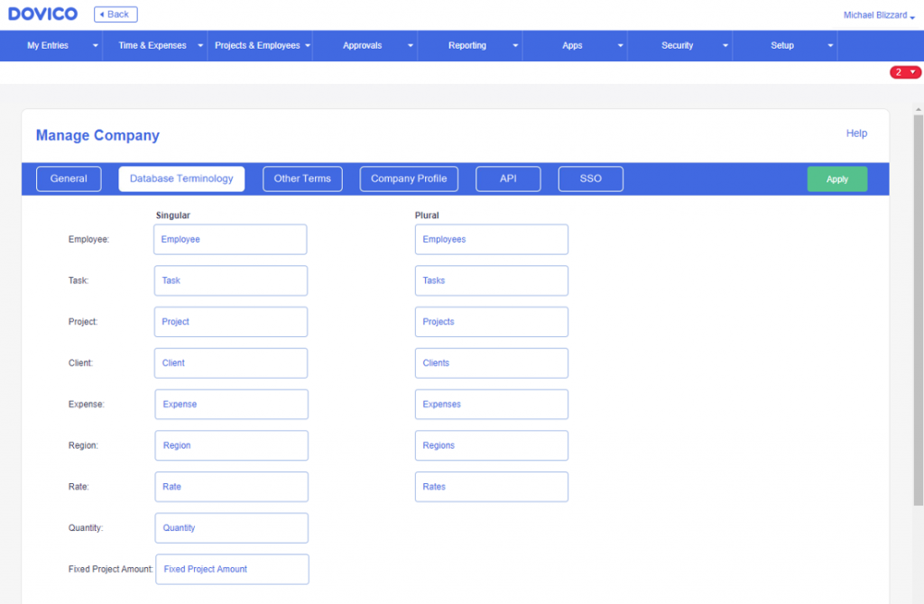
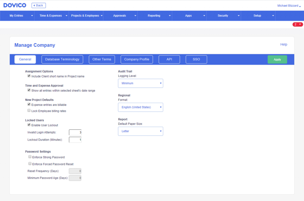
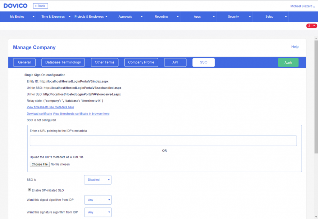
Company Settings
All of the Company Settings screens are now in-line with the rest of the look-and-feel of Dovico Timesheet. Functionality is the same, just it looks a lot better.
With spring brings change, a renewal, and a breath of fresh air. Dovico Timesheet is much more refreshed and like spring, it has become much brighter and renewed. These changes are expected to be delivered to you, Tuesday, April 7th, 2020.
